// curated.cases
Next Stop: The World
Harnessing generative AI to architect a hyper-realistic print series for the 2026 World Cup, capturing the grassroots origins of global football legends.

Setanta Sports. A Strong Identity.
Establishing a bold visual legacy amidst constant change, turning organizational shifts into a cohesive multi-market identity.

Ohania. Humanizing Family Travel.
Architecting a machine-learning ecosystem that translates complex family data into seamless, transparent, and tailor-made travel experiences.

Entel. The Disconnection Pact.
Leveraging proximity technology to challenge a mobile operator's own business model, fostering real-life presence through intentional disconnection.

Coca-Cola. An Earned Smile.
Turning 10 million social interactions into a feat of industrial design, justifying production innovation through global awareness.

// type.crafts
Since 2011, I’ve explored typography as the ultimate bridge between idea and form. For me, designing a typeface is about creating a tool that allows others to write with character. This collection is the result of that ongoing fascination, a series of unique voices crafted whenever a new idea meets the time to make it real.


// about.me

Born in Madrid. Thinking globally.
My perspective is shaped by over 15 years navigating the intersection of brand strategy and creative leadership. From the vibrant agency landscapes of Madrid, Lima, and Tbilisi, to leading a comprehensive brand evolution in the international sports arena, I have dedicated my career to aligning business objectives with high-end design.I collaborate with international partners to transform organizational complexity into clear, impactful design narratives. I don’t just create visuals; I architect the enduring identity of brands that need to resonate in a busy global market.
Strategic Design · Brand Architecture · Creative Leadership · Visual Identity · Typography · Type Design · Calligraphy · Photography · Art Direction · Design Systems · Editorial Design · Digital Branding · Design Consultancy
// contact.me
Currently balancing full-time leadership with select strategic projects for 2026. If your project demands a blend of deep strategy and refined craft, let’s discuss how we can build something purposeful together.
// next.stop:the.world
> Setanta Sports / 2026 / In-house Creative Director
_the opportunity
The 2026 World Cup represents the ultimate peak for global sports marketing and broadcasting networks. When Setanta Sports secured the official broadcasting rights for the tournament, it unlocked a massive commercial opportunity to capture regional market attention.Recognizing this momentum, this self-initiated creative campaign was proactively pitched to bridge the gap between multi-million-dollar modern icons and their humble, grassroots origins.Upon seeing the strategic value and emotional resonance of the concept, the internal content team officially adopted the series to lead the network’s organic social media strategy throughout the World Cup.

_the strategy
The core strategy relied on nostalgia, cultural heritage, and the concept of global projection: how local talent becomes a worldwide phenomenon through the lens of the World Cup.By establishing a rigid framework of 10 distinct visual chapters (each dedicated to a specific country), the narrative was built around a fictional "5-player dream team" composed of different generations of historical legends from each nation. Conceptually, the approach stripped away the glamorous stadium lights, placing these renowned icons together as young, unpolished prospects in hyper-realistic, culturally representative local settings; the very cradles of football in their respective countries.

_the outcome
What began as an internal, forward-thinking exploration successfully evolved into an official creative benchmark for the network.Recognizing the project's exceptional visual fidelity and emotional depth, the Setanta Sports Content Team chose to feature the series as a standalone, high-concept artistic showcase across social platforms. Rather than standard promotional asset generation, the initiative was celebrated internally for pushing boundaries, positioning the network's output well above the creative standards of industry-reference accounts and establishing a new narrative blueprint for authentic, premium sports storytelling.The complete series comprises 10 distinct visual chapters, each acting as a standalone tribute to a nation's footballing heritage. Displayed below are the final high-fidelity compositions, showcasing the historical dream teams meticulously integrated into the raw, local environments that defined their earliest days in the sport.


// a.strong.identity
> Setanta Sports / 2023-2026 / In-house Creative Director
_the opportunity
When I joined Setanta Sports, the brand faced a common challenge in large-scale networks: it existed through a logo, but lacked a visual language to sustain it.
There were no style guides or established frameworks, leading to a fragmented presence across different markets and digital platforms.Our goal wasn't just an aesthetic update; it was a strategic consolidation. We needed to equip the brand with a robust visual identity that preserved its heritage while enabling it to compete in the high-speed, modern broadcasting landscape.
BEFORE - BEFORE - BEFORE - BEFORE - BEFORE - BEFORE - BEFORE - BEFORE - BEFORE - BEFORE

BEFORE - BEFORE - BEFORE - BEFORE - BEFORE - BEFORE - BEFORE - BEFORE - BEFORE - BEFORE
_the strategy
It consisted of an optimization for the global scale. Our approach focused on a tactical evolution rather than a complete overhaul. We aimed to turn a static asset into a living system:
Refining the Core - Legibility & Precision: We re-engineered the logo’s structure to ensure it could perform in high-pressure environments. By introducing a containment box for the symbol, we guaranteed the brand’s legibility across unpredictable backgrounds, from chaotic stadium environments to high-definition on-air graphics. Additionally, we modernized the typographic alignment to create a responsive framework, allowing the identity to accommodate future sub-brands and digital-first layouts seamlessly.
A Proprietary Visual Grammar: To establish a unique voice, we developed a complete visual system. This included a custom-made typeface for headlines to build brand equity, paired with a versatile, multi-language font family to ensure seamless communication across all international markets. This grammar was rounded out with a proprietary iconography set and a revamped color palette, ensuring the brand remains authoritative and recognizable even when the logo isn't the primary focus.

Operational Excellence: Scalability at 24/7 Speed: The redesign was built for the reality of a 24/7 sports platform. We transformed the brand into an agile operational system by creating a library of hundreds of modular templates, including many where the competitions' identity was also merged. This allowed both internal production teams and external partners to generate high-quality visuals with minimal effort, ensuring brand consistency at the speed of live sports news.


_the outcome
The result was the shift from an isolated visual asset to a unified and professional global identity.1. Organizational Cohesion: We ensured every department and partner followed a single visual code, eliminating ambiguity and strengthening Setanta Sports’ market authority.2. Performance-Driven Design: The technical optimization of the logo significantly improved visual impact on mobile and digital environments, where legibility is the primary driver of engagement.3. Future-Proof Legacy: By establishing these foundational guidelines, we created the necessary infrastructure for the brand to scale its audiovisual production without losing its core DNA.
// humanizing.family.travel
> Ohania / 2019 / Demium / Entrepreneur CMO
_the opportunity
While platforms like Journy had successfully captured the "wealthy millennial" segment in the US, a significant gap remained in the international market: the family travel paradox.Through market analysis, we identified that families with children face unique logistical frictions that traditional travel agencies and modern "foodie" apps fail to address.Ohania was born within the Demium Startups incubator to solve this, pivoting a proven business model toward an underserved, high-value target: parents seeking bespoke global experiences without the logistical overhead.

_the strategy
Our approach was rooted in User-Centric Validation. We didn't just guess; we interviewed 50 parents to deconstruct their decision-making process.The Insight: Travel with children isn't just about the destination; it’s about the "peace of mind" during the journey.The Brand Architecture: We crafted a brand identity around "Proximity and Transparency." The naming, combining Ohana (Family) with the suffix -ia (Land), was strategically chosen for its cross-language phonetic softness and emotional resonance.Visual DNA: We moved away from cold, corporate travel aesthetics, opting for a warm light green palette and a custom rounded script logo to communicate empathy and accessibility.


_the outcome
The result was a high-fidelity digital ecosystem designed to turn complex data into a seamless narrative.1. Iterative Intelligence: We performed a deep-dive teardown of existing competitors with real users. This research revealed a critical "trust gap" in automated bots. Our strategy was to replace "fake" AI with a hybrid model: local travel designers supported by a transparent, narrative interface.2. Information Architecture: Through card sorting and user flow mapping, we reduced the friction of trip planning. We designed a questionnaire that felt like a conversation rather than a form, ensuring the length of the process was perceived as "value-added customization" rather than "administrative work."

3. From Sketch to Validation: The final product consisted of four core interfaces, from a high-conversion Home to a complex User Dashboard. Every screen was stress-tested through high-fidelity prototyping, with a focus on the payment flow to validate the business model's viability.

4. The Result: A mobile-first, adaptive platform that transforms the stress of family logistics into a curated, interactive timeline, proving that machine-led efficiency and human empathy can coexist in a single product.


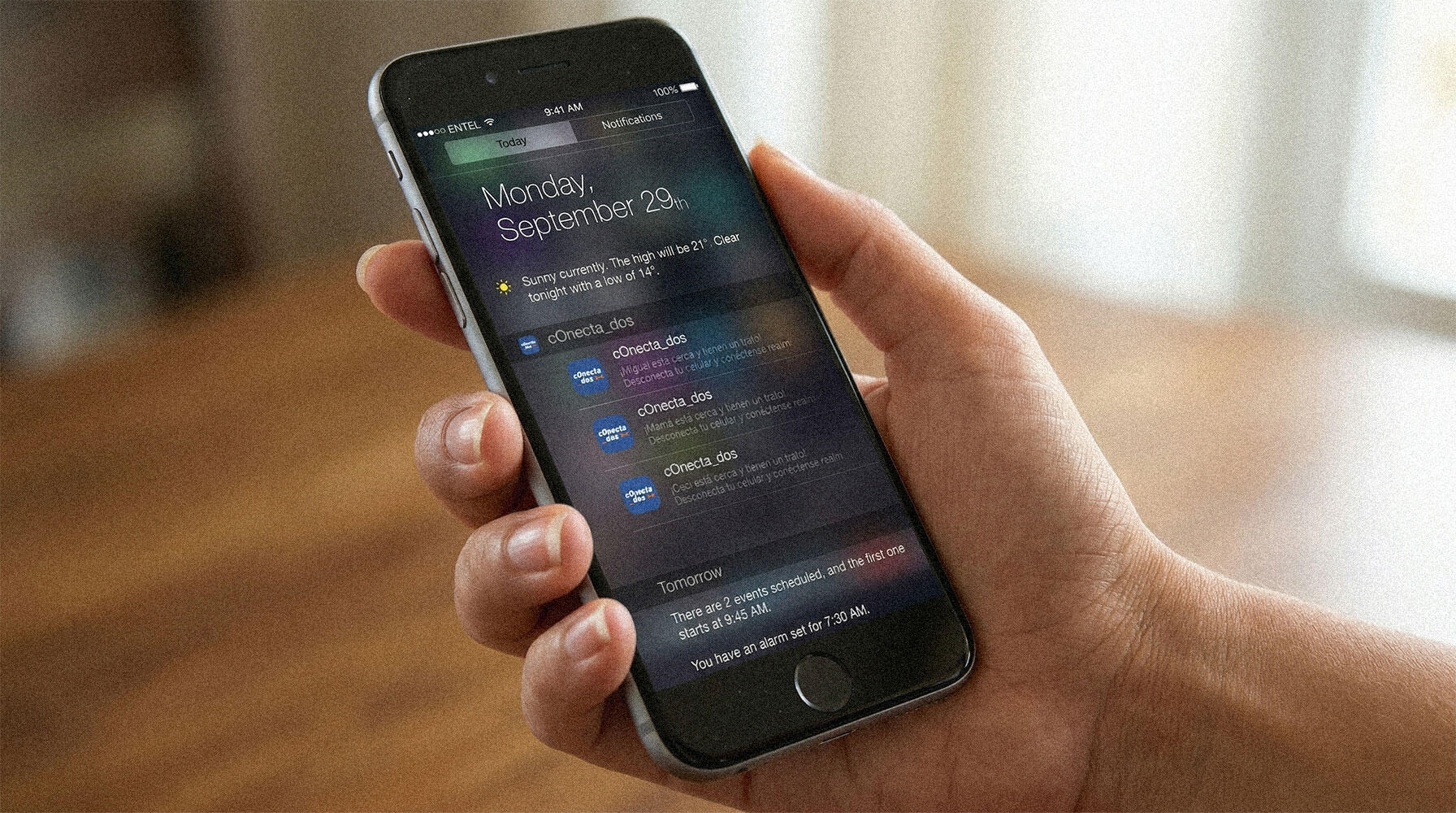
// the.disconnection.pact
> Entel / 2016 / Tribeca Media / Creative Director
_the opportunity
Entel is a telecommunications giant; their business model relies on people staying connected. The challenge was to flip that script: How can a Telco lead a conversation on digital wellness without sounding hypocritical?At Tribeca Media Peru, we proposed moving beyond traditional advertising to create a tangible tool: Conectados. An app designed to broker "connection agreements" between people, silencing digital noise to prioritize real-world presence.

_the UX roadmap
Our research process forced a significant strategic pivot, driven by two factors that only surface through deep UX discovery and technical reality checks:- The User Insight: Our customer persona, Charlie (27), a heavy mobile user, gave us the "aha" moment. He didn't want his phone to vanish, since he feared missing emergencies; he just wanted his friends to stop ignoring him at the table.
Demographics
- Charlie, 27. Based in Madrid.
- Junior Financial Consultant (30 min. commute).
- Active social life; shares a flat with two peers.
- Single, in a committed relationship.
Behaviors
- Heavy mobile user for work and personal life.
- Strict "no-phone" policy during social gatherings.
- Feels misunderstood; frequently argues about digital etiquette.
Needs & Goals
- Wants his circle to disconnect during face-to-face time.
- Seeks a way to enforce this without generating social friction.

- The Technical Wall: We discovered that iOS restrictions prevent third-party apps from automatically disabling WiFi or data for privacy reasons.- The Strategic Pivot: Rather than seeing this as a failure, we integrated it into the design. We shifted from an intrusive "automatic disconnection" to a manual "Connection Agreement." We designed a narrative interface where the user made a conscious decision to go offline. What started as an Apple technical limitation became a core brand value: disconnection as a voluntary act of respect and presence.

_the outcome
We delivered a UI that balanced Entel’s corporate authority with a welcoming, almost playful aesthetic to lower user defensiveness.During testing, 80% of users expressed a desire to download the app based solely on the curiosity sparked by the onboarding flow.100% of test subjects successfully completed the "agreement request" flow, proving we had successfully simplified a socially "awkward" action (asking someone to put their phone away) through a seamless digital interface. The flow was validated.Despite a late cut in the communication budget, the app gained organic traction. We succeeded in positioning Entel not just as a data provider, but as a human-centric brand that understands that sometimes, the best connection happens offline.


// an.earned.smile
> Coca-Cola / 2011 / McCann Madrid / Trainee Art Director
_the opportunity
Coca-Cola is a global icon defined by a universal ritual: “Open Happiness.” However, while its communication is unmistakable, the physical aluminium can remains an industrial commodity.From the top, every brand in the category is indistinguishable. We identified a strategic opportunity to move beyond the label and into the product’s industrial DNA, evolving the can’s opening to transform a functional standard into a proprietary brand signature: a literal smile at the exact moment of consumption.

_the strategy
The project was built on a Value-Exchange Model designed to solve a significant business hurdle: the high cost of industrial retooling.Instead of a traditional top-down campaign, we proposed a collective global challenge. The change in the can's design would only be triggered once the community shared 10 million “moments of happiness” online. This mechanic ensured that the manufacturing investment was pre-justified by guaranteed global engagement and massive earned media, effectively turning a production expense into a high-yield marketing asset.

_the outcome
A self-funded industrial innovation that successfully bridged the gap between brand promise and physical reality.By redesigning the shape of the opening, we turned a generic manufacturing requirement into a unique emotional touchpoint. The result is a Product-as-Media strategy where the packaging itself becomes the primary driver of brand loyalty and international notoriety, creating a ritual that competitors cannot replicate.


- STRATEGIC VALIDATION -
Years after this concept was developed at McCann Madrid, the visual of the "smiling can" was utilized by the network for outdoor advertising in Milan. However, this case study remains the original strategic blueprint, moving beyond a simple visual metaphor to propose a full-scale industrial and behavioral evolution.Seeing the idea finally validated years later, a concept born during my internship, brought a profound sense of pride rather than frustration. It was the definitive proof that the strategic intuition was correct from the very start.

Khaos is a modern display typeface designed to bring bold clarity and expressive flexibility to contemporary design. Built as an all-caps variable font, it combines strong architectural structure with creative versatility, making it ideal for headlines, editorial layouts, branding, and impactful visual communication.The typeface features three carefully crafted weights and three distinct widths, allowing designers to move seamlessly from compact, sharp statements to wide, commanding compositions. Thanks to its variable font technology, these styles are not just separate presets but part of a continuous design space, giving you precise control over weight and width to fine-tune every typographic moment.Khaos balances modern precision with expressive personality. Its clean geometry and confident rhythm make it highly readable at large sizes, while its subtle details add a refined and sophisticated edge that works beautifully across digital and print environments.Designed with global communication in mind, Khaos offers extensive multilingual support. Along with a complete Latin character set with full accent coverage, the typeface also includes Cyrillic and Georgian scripts, enabling cohesive typography across diverse languages and cultures. Khaos is built for designers who want precision, flexibility, and presence in their typography; a powerful tool for creating bold visual statements while maintaining a refined, contemporary aesthetic.


Parla is a vibrant and expressive display typeface designed to merge storied heritage with contemporary elegance. Inspired by the lively spirit of Southern Madrid and named after a kept promise, its title also translates to "talk" in Italian, positioning the font as an ideal medium for stylish and articulate communication.The typeface is characterized by its high-contrast serif architecture and a dynamic geometry that excels at both large and small scales. Its signature tilted "A" adds a rhythmic, unique personality, making it a versatile choice for fashion, travel, design, and trend-focused applications where visual flair is paramount.Parla perfectly balances a trendy, expressive energy with refined professional precision. The inclusion of bespoke ligatures and a confident visual rhythm allows it to elevate any design project, providing a sophisticated edge that captures the eye in both high-end digital environments and luxury print.Built for a global audience, Parla is equipped with an extensive range of accents and special extended-Latin characters. This technical robustness ensures seamless compatibility across multiple languages, offering designers a powerful tool for creating bold visual statements while maintaining a chic, modern, and highly personal aesthetic.


Tetuan is a sophisticated modern slab-serif display typeface designed to bring structural clarity and consistent visual impact to contemporary design. Built as a comprehensive family of six styles, featuring three carefully crafted weights with corresponding italics, it is defined by its monolinear architecture, where uniform stroke weights create a balanced, technical aesthetic ideal for headlines and branding.The typeface is characterized by its condensed geometry and rigorous horizontal-to-vertical rhythm, offering a robust presence that excels in space-restricted layouts. Its clean, "oldstyle-meets-modern" slab construction provides a confident and stable feel, making it a versatile tool for both digital environments and high-precision print projects that require a disciplined yet characterful voice.Designed for true comprehensive global communication, Tetuan offers an extensive multilingual framework. Alongside a complete Latin character set with full accent coverage and bespoke ligatures, the typeface also includes fully developed Cyrillic, Georgian, and Greek scripts. This technical breadth ensures authoritative and cohesive typography across a vast range of international languages and cultures, positioning Tetuan as a powerful global asset for the modern designer.


Benicassim is a sophisticated, ultra-condensed display typeface designed to bring high-density clarity and a fashionable edge to contemporary design. Built as a practical all-caps font, it combines a sharp vertical structure with a refined aesthetic, making it an ideal choice for impactful headlines, fashion editorial layouts, and branding where spatial efficiency is as critical as visual presence.The typeface features two distinct stylistic editions that offer designers a unique range of expressive flexibility. The Artifice edition incorporates subtle geometric flourishes and technical details for a distinct, high-end signature, while the Sans edition provides a streamlined, ornament-free alternative for clean and functional communication. These two versions are designed to complement each other, allowing for a sophisticated interplay between decorative character and minimalist precision within the same project.This typeface balances architectural rigor with a chic, modern personality. Its extremely condensed proportions allow for commanding, large-scale compositions even in highly restricted spaces, maintaining a confident and rhythmic legibility. Whether used in digital interfaces or high-quality print, its polished strokes and vertical emphasis add a layer of professional craft that feels both timeless and avant-garde.Designed with global communication in mind, it offers extensive multilingual support. Along with a complete Latin character set with full accent coverage, the typeface also includes the Cyrillic alphabet, enabling cohesive and authoritative typography across a wide range of international languages and cultures.


Miraflores is an elegant and nostalgic slab serif typeface designed to bring a refined vintage warmth to contemporary creative projects. Inspired by the quiet beauty of a traditional Spanish village, it strikes a rare balance between decorative flair and functional clarity, making it a perfect resource for designers seeking a "cute" yet sophisticated aesthetic for branding, labels, and editorial compositions.The typeface is built on a foundation of distilled simplicity, featuring two carefully balanced weights that offer a focused range of expression. While its uppercase architecture pays homage to the classic proportions of the 'Molesk' typeface, Miraflores evolves that inspiration into a more versatile and approachable system. This dual-weight structure ensures a seamless transition from high-impact headlines to legible plain text, providing a cohesive typographic voice across various formats.Miraflores excels in trend-focused designs where personality and approachability are paramount. Its subtle "vintage-chic" character and confident rhythm make it exceptionally well-suited for artisanal packaging, boutique signage, and social media storytelling. The font's inherent charm adds a layer of artisanal craft to any layout, inviting the viewer into a visual experience that feels both familiar and refreshingly modern.


